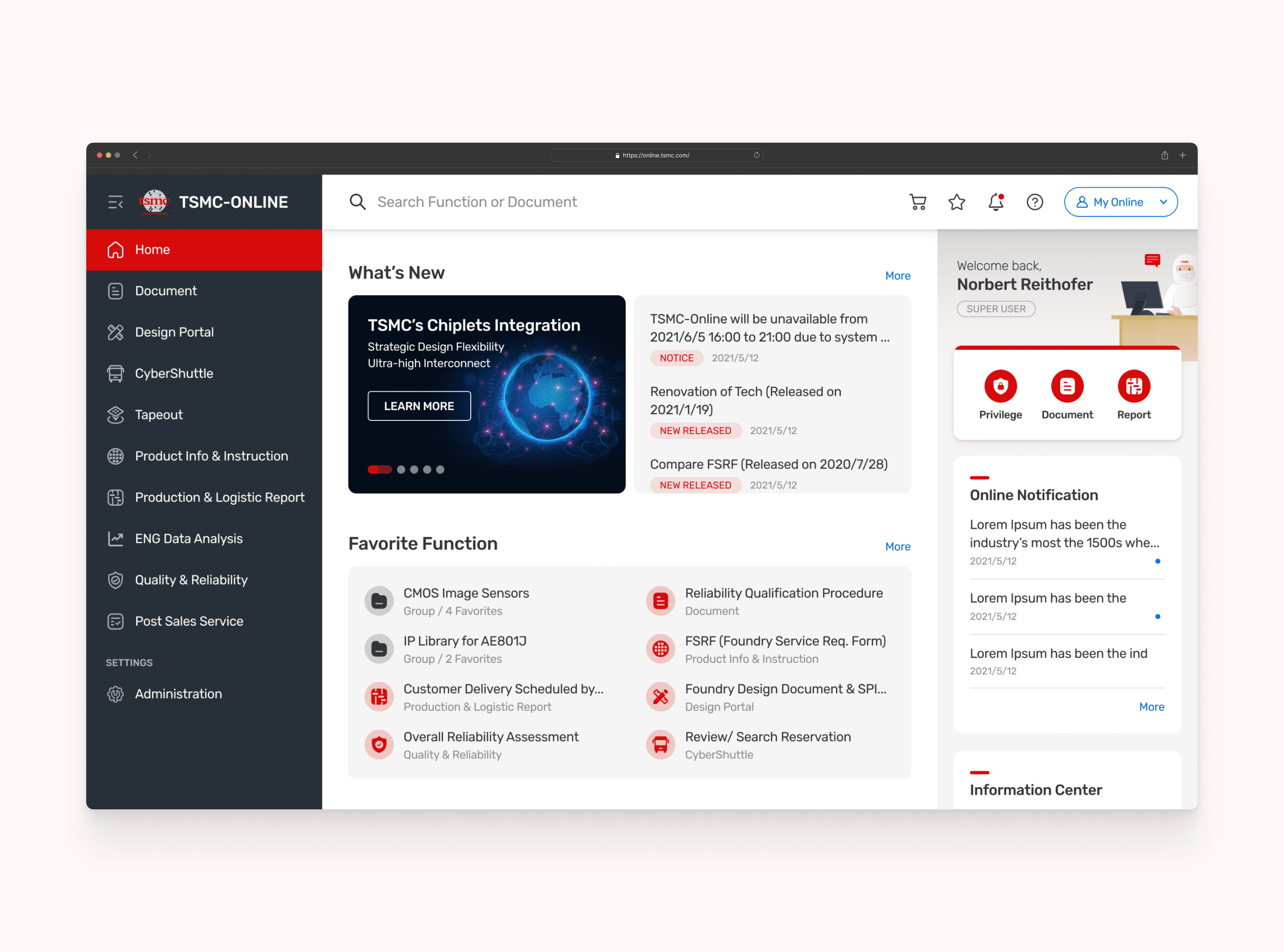
TSMC-Online Homepage & Mega Menu
Due to NDA, I’m not allowed to reveal complete design processes and deliverables. All the data is redacted and blurred and would be used for portfolio building only.
Timeline
2020.10 - 2022.12
Client
TSMC
Company size
73,000+
Role
Product Designer
Team
Challenge
Users spend much time finding the function they need during the wafer production process.
" It took me a lot of time to figure out what is tsmc's wafer process and which function I can use. " by User20.
Users don't know what that function means and get confused by the naming.
" What is the difference between Customer Delivery Schedule by PO and Customer Delivery Schedule by Product" by User2.
Beginners are having a hard time understanding and identifying all the terminology.
" What is Logic, MS/RF, and HV mean? Can you tell me the difference between them? " by User3
Results
New homepage lets clients can access their frequently used features and get the most updated information from TSMC. New mega menu helps users understand what service TSMC provides to the client and let the client know all terminologies at a glance. Designing a new information architecture, naming system and feature section for TSMC's clients, resulting in a 45% improvement in wafer manufacturing efficiency.
35%
Improved onboarding process
45%
Increase in wafer manufacturing efficiency


Process
Research & Analysis: We conducted user interviews, surveys, and analyzed in-app analytics to understand the pain points and user needs. We also studied competitor apps and industry trends to gather insights
Information Architecture: Based on the research findings, we restructured the app's navigation and content, prioritizing features and information according to user needs.
Wireframing & Prototyping: We designed low-fidelity wireframes to visualize the new layout and navigation, iteratively refining them based on user feedback. Afterward, we built a high-fidelity, interactive prototype to test the design.
Usability Testing: We conducted usability tests with a diverse group of users to validate the design and identify areas for improvement. Based on the feedback, we made necessary adjustments to the design.
Visual Design & Style Guide: We developed a cohesive visual language, including color schemes, typography, and iconography, ensuring consistency throughout the app. We also created a style guide to maintain design consistency in future updates.

“ With our new visual branding and language in place, the new Shopify brand clearly captures the essence of our current and target customer base, our employees, and our values. ”
Tobias Lütke
CEO, Co-founder | Shopify


Conclusion
The StreamLine mobile banking app redesign successfully addressed the usability issues, resulting in a more intuitive and user-friendly experience. The improved UX/UI design led to increased user adoption, engagement, and satisfaction, demonstrating the value of a well-designed template for UX designers.
Ready to Elevate Your Project?
Let's bring your design vision to life.